News

Marijuana Venture: Let's get Visual

Visual merchandising experts explain how cannabis retailers can sell more by displaying less

Throughout North America, the regulations for displaying cannabis in stores vary from apothecary-style shops where product can be weighed, inspected and bagged at the counter to the overly-secure, appointment-only dispensaries where customers are required to bring their own state-approved lockbox to transport the product off the premises.

Even in most recreational stores, cannabis cannot be displayed the same as traditional retail products. But while the industry may still be years away from having elaborate window displays, the race to modernize cannabis retail stores is forcing many operators to keep up with the times.

“There’s this whole anti-establishment vibe to the (cannabis) culture, but the establishment is what’s being successful,” says Anne Marie Luthro, the owner of AML Insights, a retail strategy and shopper insights consulting firm. “One of the first hurdles is that a lot of these retailers, which are small and independent, take what they can get instead of looking for something that works.”

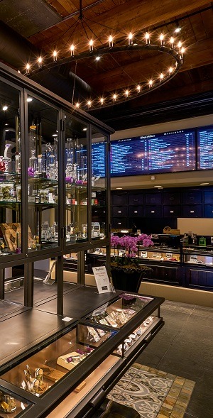
The uniform table and wall displays at The+Source in Las Vegas use spacing and simple signage to great effect. Photo courtesy of The+Source.

Accessible Displays

Cannabis stores currently have a much higher conversion rate than most retail sectors, meaning the vast majority of shoppers who enter a store leave with a purchase. But shopping experts such as Luthro say stores can increase the average customer’s purchase by improving the way products are displayed and by letting the packaging do the talking. Shops may also be able to generate more repeat business with more effective displays.

For example, glass counters are often an easy and inexpensive solution to display product, while satisfying state regulations. However, the rest of the retail world is finding innovative new ways to display products and moving away from the classic counters.

“The reason retailers are getting a great deal on these (glass counter) fixtures is because they’re outdated; normal retailers aren’t using them anymore,” Luthro says. “You do all this work to build these beautiful stores and then when people get to your product, they’re forced to stare directly down.”

Impulse Shopping

In 2008, the marketing agency Ogilvy released a study it conducted of more than 6,000 shoppers, revealing that promotional displays drive more impulse purchases than price reductions. The displays analyzed by Ogilvy were not elaborate productions; in fact, many were simple cardboard stands that placed the product outside the uniformity of the aisles shoppers usually peruse.

The study showed that 29% of consumers made purchases that were categorically outside their reason for visiting the store and 24% of that group reported the purchases were prompted by in-store displays. The study also showed that 39% of consumers enter a store with the idea of the product they want and choose a brand based on price, demonstrations, displays and packaging. Ogilvy also found that in the case of convenience store snacks, 49% of purchases were initiated by displays.

Luthro conducted a study on sunglasses, which are commonly displayed in a similar fashion to cannabis, to see how the shopping experience changed when the merchandise was lifted higher and removed from its cases. The study found that sunglasses were suddenly more interesting to shoppers, and sales increased at the store. She found that part of the problem was customers not feeling comfortable browsing when they needed to ask a sales associate every time they wanted to try on a pair of glasses. Luthro recognizes that most regulations prevent cannabis from being displayed out in the open, but she says lifting the product to eye level can lead to more sales and repeat business.

“There’s an old saying, ‘In fixtures and signage: Knees and below, no go,’” Luthro says.

One of the best ways for retailers to create a more engaging environment for shoppers is to incorporate vertical fixtures into the design, Luthro says. 

However, if that’s too much of an investment, a few simple adjustments can improve existing displays. Luthro suggests facing the product at an angle, so shoppers can see and identify it from a greater distance. She also recommends displaying empty packaging at eye level around the store so consumers can learn about the product at their own pace.

“When you give something height, you give it importance,” says Linda Cahan, a retail design consultant for Cahan & Company.

On the sales floor of Diego Pellicer, well-lit, eye-level and waist-level fixtures give customers the same independence they would find at non-cannabis retailers.

Adding vertical displays to the store not only keeps heads lifted and eyes moving, but it also creates a visual break that prevents shoppers from feeling intimidated. As in Luthro’s sunglasses experiment, when customers are not intimidated, they browse more and ultimately buy more.

“‘Overwhelmed’ is a big emotion, especially for newer shoppers,” Luthro says. “Even if you’ve been smoking (cannabis) for your entire life, shopping for it is really different.”

Order from Chaos

Eric Feigenbaum, president of Embrace Design and one of the world’s leading authorities on visual merchandising, explains how the sensation of being overwhelmed can prevent customers from focusing on any of the inventory and even stop them from shopping altogether.

“It’s our job as visual merchandisers to create order out of chaos,” Feigenbaum says. “Nothing will drive a customer out of a retail store faster than seeing a sea of flat merchandise. You want to pick your spots where you want to elevate your products. In any design, even in music, it’s modulation that makes it interesting.”

Choosing what to display and where is vital inside a retail store, as it guides the consumer experience. Since the majority of shoppers turn right upon entering a retail establishment, most retailers provide an eye-level path of products to lead customers through the store. By keeping each category of product at eye level and segmented with physical or visual gaps, retailers can let shoppers know when they have hit the end of each category — not only dividing products between indicas and sativas, but even between brands, Luthro says.

Feigenbaum says lighting can also make or break consumer engagement. He suggests using four variations of lighting throughout the store: ambient lighting to provide the store’s setting; task lighting to point customers to the register or help desk; high light, the brightest of the four, to illuminate displays; and decorative lighting he calls “architectural jewelry,” such as chandeliers and sconces.


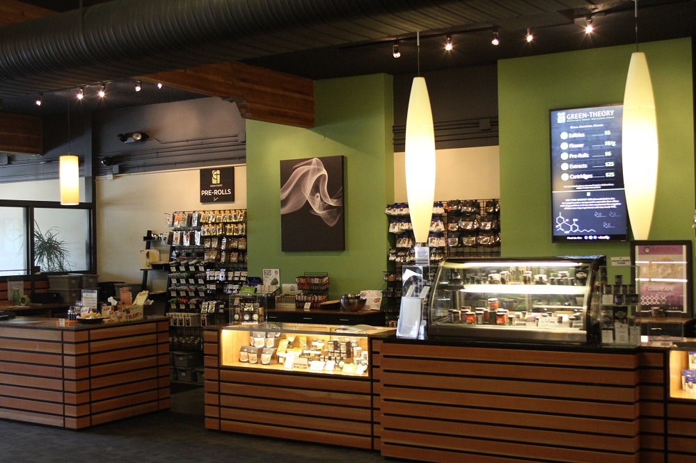
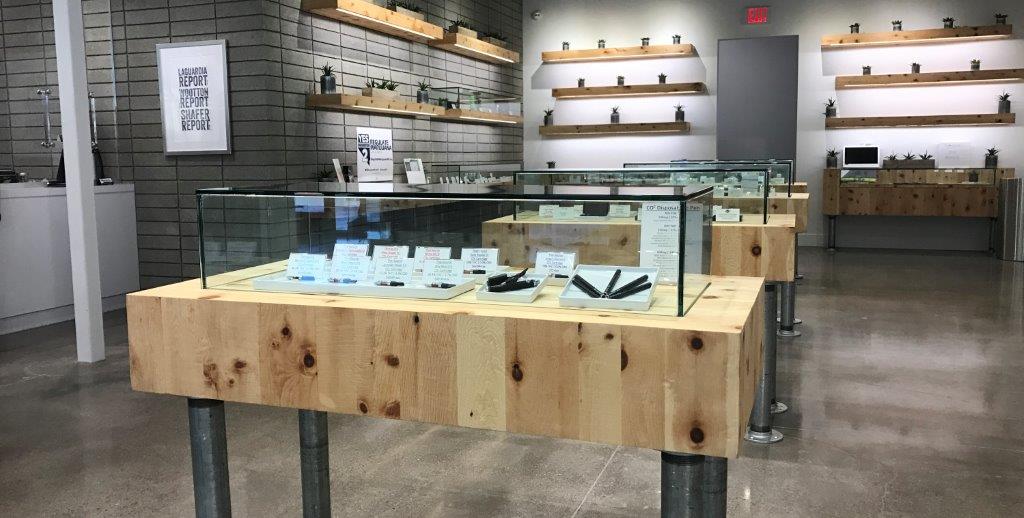
Green Theory uses visual breaks and varying display heights to avoid overwhelming shoppers and to keep displays interesting.

Fixing Fixtures

Feigenbaum says the golden rule of display fixtures is best summarized by the famous quote from architect Louis Sullivan: “Form follows function.”

“The most important part of fixturing is that it works,” Feigenbaum says. “And by work, I mean that it has to house the merchandise, display the merchandise and it has to make the merchandise accessible to the customer. Additionally — and this is key to me — is that through its design and aesthetic, it has to communicate the attributes of the merchandise.”

While cannabis products are likely going to remain under lock and key for the foreseeable future, that doesn’t mean retailers can’t provide a self-guided shopping experience. Simple displays with empty packaging, a single item with a placard description, or a laminated information card with a photo of the product can give shoppers the independence they are used to having at traditional retail stores.

“Even the most expensive diamond ring, you can put it on,” Luthro says. “Cannabis is one of the only products you can’t touch; therefore, the words and visuals need to be more on-point than in any other store.”

DeAnna Radaj, the owner and design consultant behind DeAnna on Design, says there are three core options for floor displays: the mass-out display, where a larger and less permanent fixture dominates the floor space to promote a sale that would typically relate to an event or holiday; table displays that highlight a single company or item; and lifestyle displays, which allow customers to see a re-creation of an in-use scenario of several products that complement each other.

Table displays — or speed bumps, as some merchandisers call them for their ability to slow down shoppers — should always contain an odd number of items (up to seven, according to Cahan) and orientated to the right since most consumers are right-handed. Odd-numbered displays give viewers a focal point, whereas even numbers create symmetry. Odd numbered displays compel the eyes to move around the frame of the display and then center, Cahan says.

“When you have a lot of small items, then geometry is the way to go,” she adds. “If it’s too free-form in your displays, people won’t see them because their minds are too busy trying to organize the merchandise into some form, so they can discern what they actually want to look at. But when things are geometric, the mind immediately goes, ‘Okay, so these are together.’”

Larger product manufacturers can provide interesting displays for retailers at little to no cost.

A Visual Story

Cahan says every display should tell a story. Shoppers are used to artisan brands detailing the company and process behind the products and manufacturers should be ready to supply the extra marketing items upon request.

Radaj recommends spinner racks, slat walls and small glass cubes as inexpensive and versatile options for floor displays.

But Cahan says every retailer is responsible for their own look. While it may be easy for vertically integrated businesses to design packaging that fits the theme of their stores, retailers that rely on third-party suppliers should either try to find products that work for their aesthetic or repackage the products in a display that works for their style. Such displays should carry a sort of visual garnish that anchors the feel of the store. A permanent fixture that is different, yet cohesive with the interior design, can be used to repackage out-of-place products.

For example, Cahan says, if a retailer uses a lot of wood in the store, they might want to use an unfinished metal display to juxtapose a particular product.

“You don’t want it to be all the same,” she says, “and you don’t want it to be more interesting than your merchandise.”

Read more →

Pot Shop Windows

cannabis retail


In an industry where windows are highly regulated do windows even matter in pot shops?  YES!!!! 

As shoppers, we expect a store to have WINDOWS and for those windows to serve specific purposes (who's this store for? what does this store sell? what's the vibe here? is it open??) every pot shop deserves a good window. 

Let's make yours great.

Window of Opportunity:  Know how much time people spend in front of your window space. The average time to passby a window (whether in a mall or on the street) is 3 seconds.  Work within this window of opportunity.  Send a message that can be absorbed in 3 seconds or less.

Proximity:  How near or far are people from your window? Use this info to scale the size of the display. Smaller intricate window displays will only read to people passing a few feet from the glass, a larger display is necessary for those driving by or across the street. It's possible that you need BOTH if you have both types of passers.

Show versus Tell:  The fewer words you use in a window the better. Send messages via props and products and images rather than text.

Capture Attention:  Incorporating movement (real or perceived), using dramatic lighting and canting the display to face passersby (versus head-on) are all ways to capture passers' attention.

Keep It Fresh:  Changing something in the window every 3-5 weeks will keep shoppers looking.  If the window stays static, attention wanes and shoppers stop looking. 

Don't waste any opportunities to pull eyes to your store. Your windows are a valuable tool– Use them!

Read more →

Main Street America Doing Its Best

Main Street America Doing Its Best

King 5 video AML in action!
Read more →

Best ways to implement new technologies into spa merchandising

Written by Linda Cahan for Spa Retailer Magazine
Customers want what they want — and they want it for the same
price as on-the-floor units. Remember buying a car and adding
goodies one-by-one rather than buying a package? Customers now
want to do that with their spas.
Combine that need for control with integrated sound systems, jet
and water-temperature controls, and sophisticated circuit boards, and
you get customers who want everything they saw online.
Electronics allow you to customize the visual shopping experience
for your customers as well. Nothing says “future” quite like electronics.
The spas in your stores are becoming more complicated and
electronically sophisticated. But are you adding electronics into your
stores as well?
Brian Dyches is a partner with OpenEye Global, a leading Digital
Experience Design Agency in the United States. Well-versed in the
pool and spa industry and as a designer and consultant, Dyches has
worked with numerous retailers around North America. He designed
an award-winning Hot Springs Spa store and worked with Dimension
One on its retail brand program. He has also spoken frequently in the
industry on retail design and digital branding. Dyches suggests that
if you’re adding just one digital element, start with a monitor behind
the service desk or cash wrap. The other ideal location is if you have a
dedicated soak room with a wall. You have a captive audience in this
room.
A good 50-second (looped) presentation will showcase your work,
increase the believability and authenticity of your brand and begin to
build customer engagement while creating loyalty. Make
sure you tell a great visual story. This is your in-store
advertising. The actual technology needed is a digital
monitor and a media player. These give you the opportunity
and ability to create digital content on your own.
Anne Marie Luthro, owner of AML Insights, has
spent the last 20 years focusing a critical eye on all
things retail- and shopper-centric. She has spent two
decades studying the environmental factors that influence
purchasing decisions and the psychology of shopping
behavior. This research has earned Luthro a reputation
as a leading authority in the industry of retail design.
Luthro loves in-store video as well and knows it
makes the shopping experience very contemporary. But
she prefers to see it on tablets in a minimum of three to
four locations around your spas. She stresses how visually
entertaining and important a visual guide on a tablet can
be to showing how a spa unit looks in different environ-
ments. The content on the iPad/tablet can sell not just
your products but also your expertise, installation and
other services you provide. For example: This is how this
unit looks in a gazebo, in the home, the backyard, with
a built-in deck, etc. This type of content helps put
the shopper in that experience. This also gives you an
opportunity to upsell accessories as well as any unique
installations your company offers.
Both Dyches and Luthro say content is king. If you
do something amateurish, it will downgrade people’s
perceptions about your ability to sell, knowledge of your
products, and your ability to successfully install and
maintain what you sell.
Another important thing to note: This isn’t a Best
Buy (or other local or online retailer) purchase. These
units need to be commercial grade or they won’t last for
any length of time.
Luthro says a poorly running digital display will kill
sales and customer confidence. “Can you do the due
diligence to keep the monitor and program in 100
percent working order?” she says. “If not, don’t do it.
A poorly running digital display shows you can’t handle
the technology. If you can’t handle a monitor, how can
they trust you handle the complicated technology that
goes into their spas?”
Luthro also says it’s not just about the monitor, but
it’s also about the entire presentation. That means it’s a
360-degree display — especially for your female shoppers
who notice everything. No one wants to see the back of a
screen, USB and power cords hanging down every which
way. To look professional, it’s got to have a clean look.
Digital signage is rarely used to its fullest potential.
Both Luthro and Dyches suggest customizing presentations
on tablets. Dyches advises creating a content strategy
where you key in a command to jump to images relevant
to your customers’ desires or questions.
Luthro looks at timing. For example, during the
weekdays, if the bulk of your customers are not at work,
they may be retired. If so, it makes sense to have various
images on your monitors to appeal to different generations’
needs and wants. On weekends, you may be getting
families. If so, images that reflect the fun the whole family
can have with a hot tub will appeal to those customers.
Keep track of the average ages of people coming into
your store by day and time. That information will give
you what you need to customize your media for your
monitors.
I asked both Luthro and Dyches what they thought
of a large digital screen in your window. Both said it
depends on your drive-by and walk-by traffic. If the
screen can’t be easily seen, it’s a waste of money. But if
you have a store near the street, and cars stop at a light
in front of your store, you have an opportunity to create
an experience for these drivers: images of people enjoying
hot tub life. This is your chance to sell them the fantasy.
You have 40 seconds at most, so skip the words and go
straight to the images.
Luthro talks about “info-fueling,” which is when you
give a shopper enough information so they can ask an
intelligent question. Knowledge is power, and people hate
appearing uneducated — but only you and your staff are
the experts. An FAQ page on each tablet gives customers
the opportunity to learn quickly and figure out what they
need to ask. But, Dyches and Luthro say, you don’t want
only fact sheets on the tablets. Make sure each tablet is
geared to the units nearby and has visuals that inspire a
purchase.
Written and Interviewed by Linda Cahan.
Linda Cahan is an internationally known expert in visual
merchandising strategy and store design. She gives seminars,
workshops, trains and consults for chain stores and independent
retailers. Along with SpaRetailer, she writes for several other retail
magazines, and is the author of two books and seven corporate
visual standards manuals. Cahan lives in West Linn, Ore.
Read more →

Mirror, Mirror On The… Money

Mirror, Mirror On The… Money

1. Made you look!
We have a hard time NOT looking at ourselves in mirrors. Watch us as we pass a dark window on a sunny day. We suck in our tummies and pull our shoulders back and, oh, what a striking reflection we cast! We slow and refocus to look in mirrors. Capitalize on it.

2. Flatter your shopper.

  • The right lighting makes everything look better.
  • Tilting a mirror is not a trick, it is a courtesy.
  • Cheap mirrors contort images, distort egos, and lose the sale.
  • Some colors are good on just about everyone. Some, not. Find ways to allow surroundings to enhance the reflection.
Mirror2


3. Be in two places at once.
Good mirror placement allows associates to see who needs help where. I can see if you’re “just browsing,” or if you’re on the precipice of needing assistance. I can keep an eye on two shopping groups at once.
Shoplifters hate mirrors. ‘nough said.

4. Context
Mirror1
I know what the shoe looks like it—that’s why I tried it on. How do they look on the rest of me? I’m taking my whole body out when I wear them. Different mirror shapes, sizes and placements have different functions.

Worst mirrors? AllSaints Spitalfields
Why? “Antique”-look distorts and allows less light reflection (the mirrors are dark and blotchy- although I doubt cheap.)
Best mirrors? Above the wheelchair accessible sinks in public restrooms.
Why? They’re tilted.

Read more →

Be a better store. 3 things to do NOW

Be a better store. 3 things to do NOW

How are you? You’re fine.

Be better!

1. Add Reading Glasses

If your shopper is over 39, she doesn’t want to have to take her glasses out to read a tag, the receipt, tertiary signage, etc. Reading glasses are ubiquitous, except when we need them. Be a realist. Find a simple way to supply reading glasses at key points in the store.

  • The most obvious places for glasses are fitting rooms and cash wraps.
  • Make your glasses YOURS (e.g. tie a feather to the hinge) to keep them from accidently being worn out the door.
  • Position/Merchandise the first pair of glasses conspicuously to train shoppers to look for them.
  • DON’T make them monocles or one-armed–that just means they’re hard to handle.  1GlassesB

2. Measure Time in Store

I know you’re busy.  That’s the point.  Make the most of busy.  Use your phone’s timer, keep a notepad on you, at the counter, etc. and record the time (hour, minute, second) shoppers enter and the time they leave.  Do math.  Note the duration. DON’T do this when “you have the time,” but prioritize it for one week.  Average time in store is your most important window of opportunity.

Screen Shot 2013-09-23 at 1.56.59 PM

  • Take yourself through your store in that amount of time and  see what you see/do/hear/feel.  Put yourself in your shoppers’ shoes. 
  • When we move along to Next Steps at Being Better, there are more measurements you can add to paint an even more robust picture of your shopper’s experience.
  • DON’T focus on pushing the limits of shoppers’ time in store– work with what you have and it will grow organically, as it needs.

3. Ban the Tape

A sign taped to your window, your cash wrap, a fixture, etc., sends an unintentional message.  Don’t ignore the vehicle- it’s as important as the message. Is it really so urgent you didn’t have time to post it in a finished manner?  Do your store hours really change so often that you can’t print, laminate and suction-cup-hook it to the window rather than taping it? Is taping a one-sided 8 1/2 x 11” piece of paper about the Boy Scouts’ can-drive the best way to support your community?  No.

tapeWindow1 copy   tapeWindow2 copy

Triage all that’s taped:

  • If it’s urgent, put it on an “Urgent” bulletin board in a dedicated “Urgent” space.
  • If it’s permanent information, frame it or at least laminate it and re-imagine where else it may live a happier life.
  • Support your community on a Community Board.  Follow the same rules as “Urgent.”
  • Seanette Corkill of Frontdoor Back (Visual Merchandising/Store Design) coined it perfectly:  “TAPE is a four-letter word.”
  • DON’T think you have to create something permanent on your doors/windows–make it easy to move, change, etc. (think suction cups and static clings.)

suction cup on window   Bulletin board outside   store hours framed

Read more →

Back-To-School Shopping Stays Old School

Back-To-School Shopping Stays Old School

“But the bulk of consumers will continue to do their back-to-school shopping in stores rather than online, according to researchers.” [Tiffany Hsu, Los Angeles Times] [1]
Did you hear the lady? “IN STORES.”

Going to the store to shop back-to-school (BTS) supplies is a rite of passage (at least for privileged American kids.) We’re talking about good, old-fashioned supplies: pencils, pens, spiral notebooks, and Trapper Keepers. BTS supply shopping is the portal into the magical thinking that, “If everything is new and clean and organized, I will perform better!” If you study these kids and their glassy-eyed stares long enough, you can envision them in 20 years as 30-somethings wandering the aisles of The Container Store quietly chanting, “This is what I need. This will change everything.”

Many retailers were on the bandwagon of “giving back” by helping kids get the supplies they need. Target’s Give With Target backpack campaign[2] struck an important emotional and status chord by understanding that simply having the backpack was a huge morale boost for kids who couldn’t afford or access one themselves.

Walmart focused on the value side of the equation by airing ads that show a family shopping, buying and saving in their stores. The best BTS TV spot, though, had to be Kmart’s, Yo Mama[3], a refreshing twist on a usually negative adage.

Macy’s partnered with RIF this year to “give back” (Be Book Smart.) They offered shoppers an in-store coupon for every $3 donated to RIF. RIF is very important, especially to Macy’s. [snark alert] If we don’t teach our kids to read, how will they make their way through all that overload of text on the Macy’s in-store signs and flyers?
Sauce for the goose…sauce for the gander.
Macy's_RIF

We see what we want (or who we aspire to be) on TV and we want at least some essence of that to carry through to the floor of the store. To a 5th grader, going to Dad’s office supply store for BTS is not a celebratory outing. Dad’s stores are old and scary and a little boring. There is a fortress of technology (designed for work, not play) at the front, and nothing in the store says that kids are welcome. Shopping for supplies where Mom shops, however, is a celebration. Target and Walmart are fun. The selection is outrageous. The prices are very competitive and the section is full of life and other kids who are awakening to the beauty of magical thinking. I celebrate at Target; I check something off of a list at Office Depot.

BTS is the second biggest holiday shopping event. It’s a far cry from Holiday (with a capital H, as in Christmas) but it’s huge- a $73B business (Holiday is $579B). This year, the annual household spend on all supplies (apparel/shoes, supplies, tech, etc.) was $635. (Mine was about $36 and I don’t even have kids. I just love notebooks and pens, and I was in the stores for research.) Create a celebratory BTS experience in your media AND in your store and watch your share of that $73B grow.

Read more →

Thank you, Ron Johnson

Thank you, Ron Johnson

Why people weren’t buying at JCP under Johnson’s leadership, I don’t purport to know. (“Carpetbagger Conspiracy” comes to mind, as do poor communication skills and exclusionary, “we/they” thinking.) What he did to bring a modicum of sophistication, contemporaneity and intelligence to middle-income America, I thank him for.
Read more →

Put a hook on it.

Put a hook on it.

The under-the-table bag hook. A simple, little thing that lets the ladies know, “you get it”.  Nothing fancy–just a practical hook (retail price, less than $1) to keep us from having to drape our purses on the backs of our chairs (vulnerable, conspicuous, cumbersome) or setting them on the floor (gross). It’s becoming practice at many places (namely bars and cafes) but not enough.

We feel more confident and comfortable in your space, and we keep it clean and clear. At retail, we free up our hands to shop. Think about it. You put a mirror on the floor for us to try something on. Something usually comes OFF first (a bag, a jacket…). Why not just add a hook to the fixture? Win-win-win.

Just put a hook on it.

Read more →